Having formed in 1874, the Birmingham Architectural Association may have a long history but they've always been about generating debate and discussion on current issues and future trends within architecture and the built environment.
They asked us to design a punchy, distinctive and relevant brand identity to better represent and identify them, and to help raise their profile in both the city and wider region.
Needing to appeal to designers – albeit those of buildings rather than logos – we had to ensure BAA's look is stylish, neat and well-designed.

The identity comprises of a distinctive logo which echoes architectural lines, and retains the original orange and dark grey colour palette whilst now also making playful use of angles and typography.
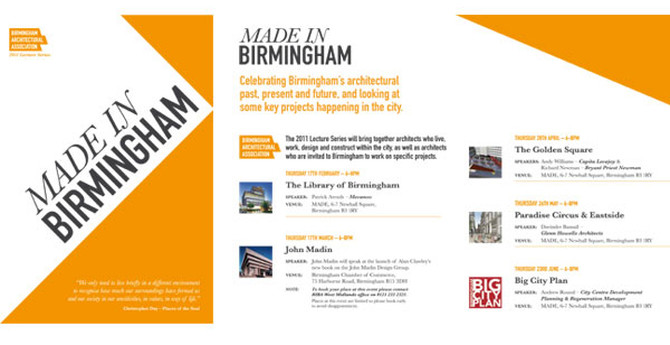
Applications of the identity so far include promotional materials for the RIBA West Midlands Region 2010 Awards and the 2011 Made in Birmingham Lecture Series.


The BAA branding has literally been an overnight success. It was launched at our annual BAAsh and has since become instantly recognisable.
Gavin Orton – President

